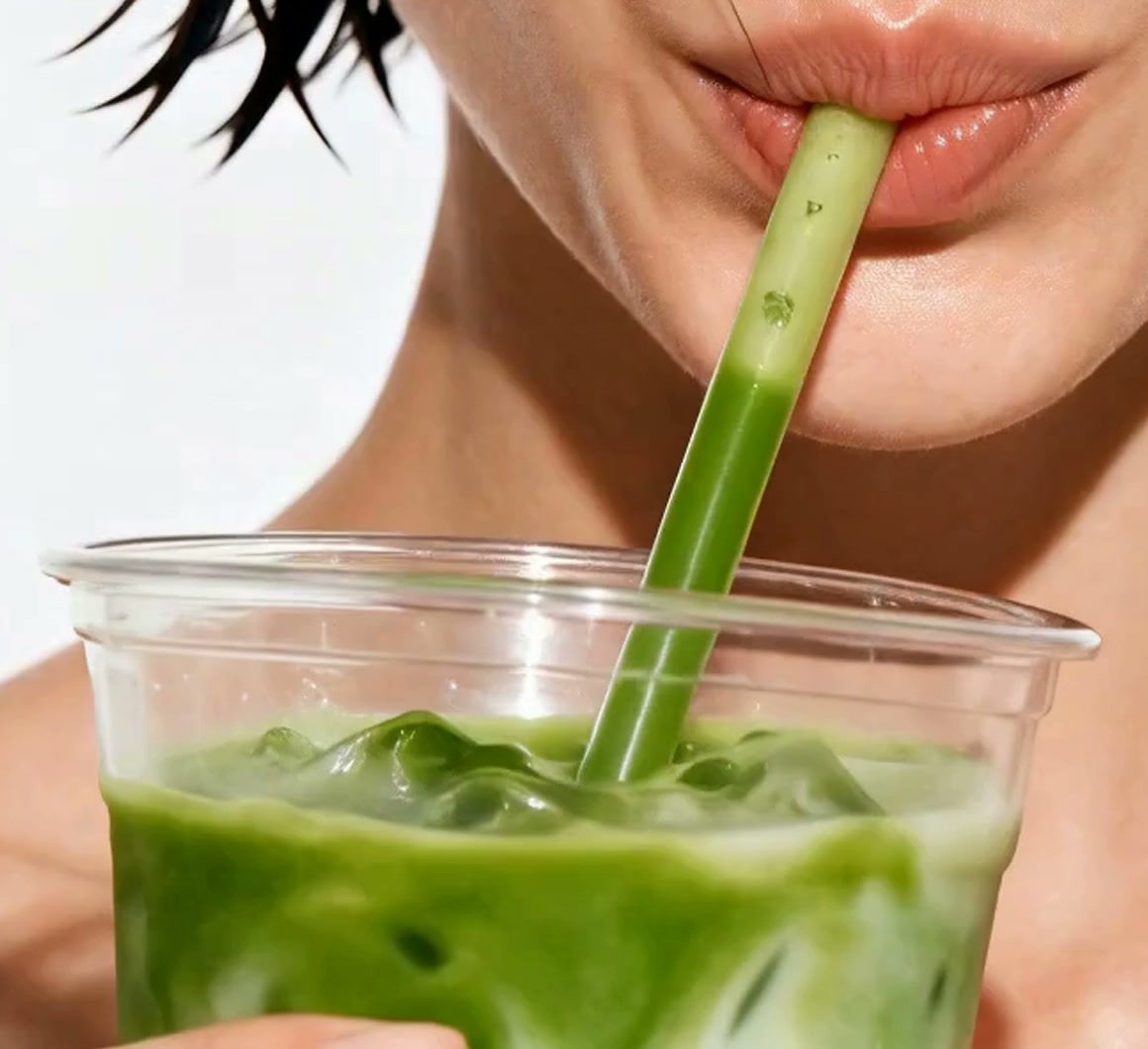
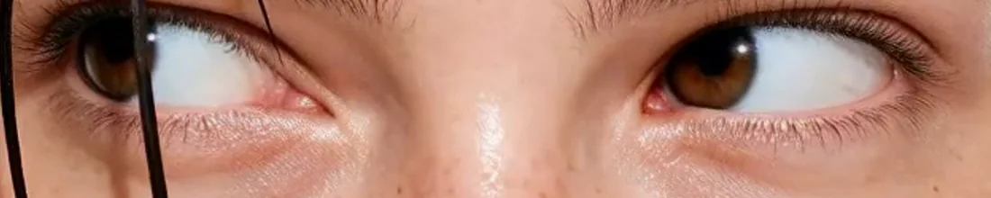
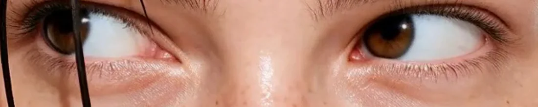
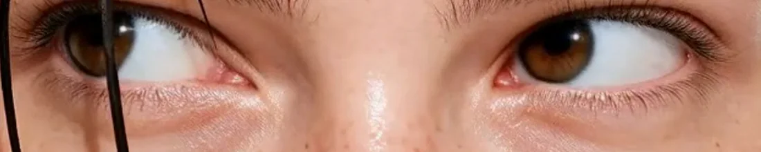
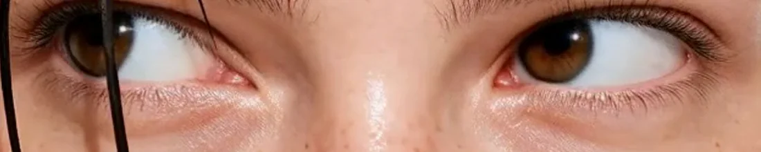



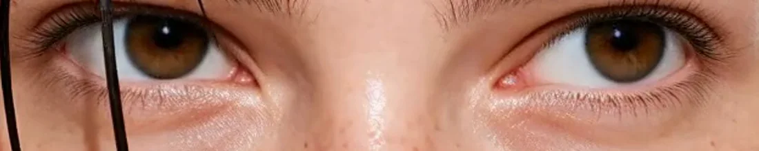
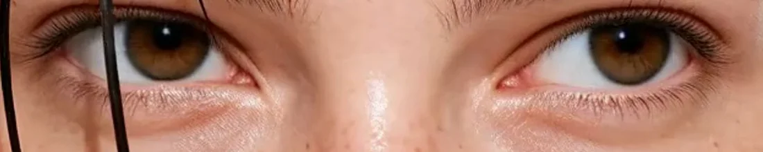
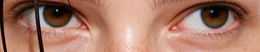
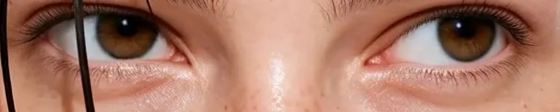
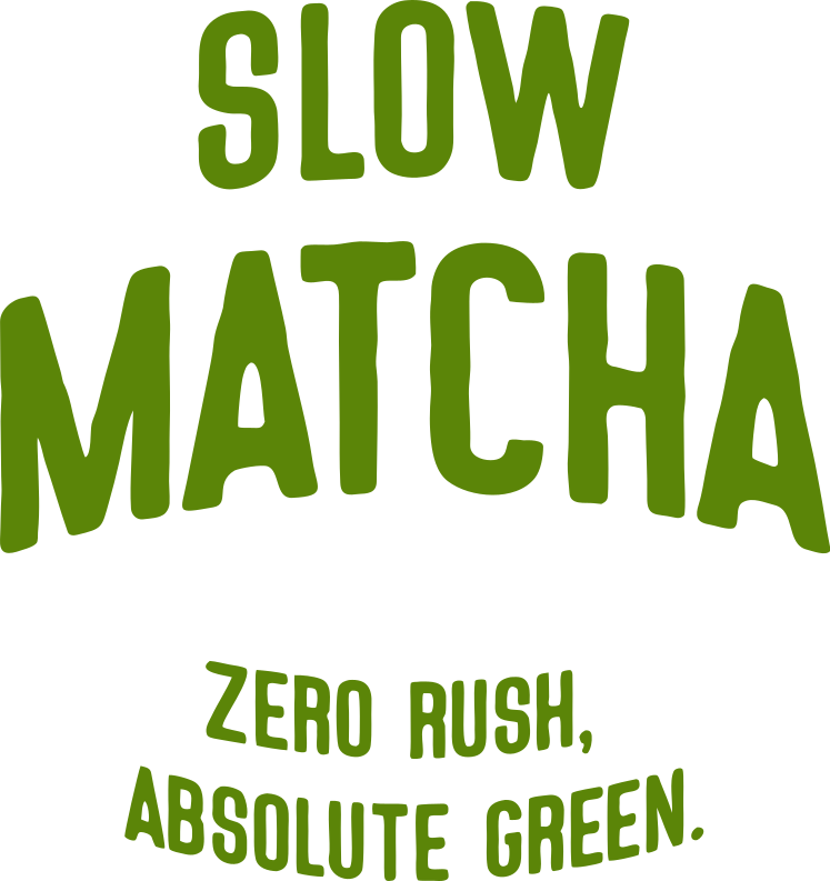

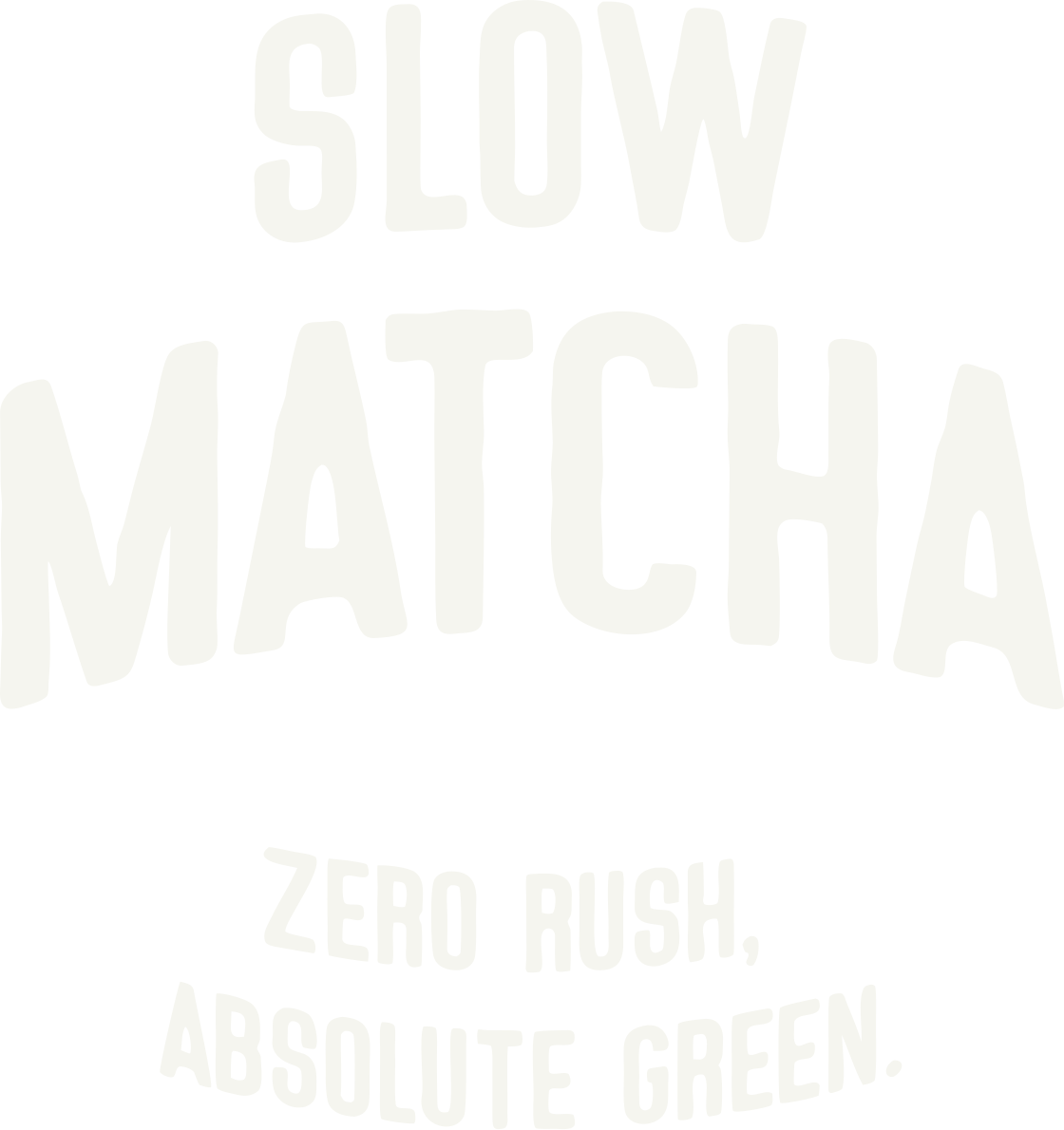
SLOW MATCHA is a matcha and sweets café built on one idea: good matcha cannot be rushed. Every drink starts with stone-ground, ceremonial-grade matcha, whisked to order and poured slowly over milk and ice, and the tagline puts it plainly: zero rush, absolute green. The identity pairs a hand-cut wordmark with a gentle bounce and one saturated green, set against cream and earthy brown. The project covers the identity and tagline, cups, shopping bags and a 30 g box of packaged matcha, the café menu, and a campaign that runs from building banners to bus shelters, each one placing a single slow drink in the middle of a busy day. Every image in the campaign was created with generative AI.SLOW MATCHA는 '좋은 말차는 서두를 수 없다'는 생각에서 출발한 말차 & 디저트 카페 콘셉트입니다. 모든 음료는 맷돌로 곱게 간 세레모니얼 등급 말차로 만들고, 주문이 들어오면 격불해 차가운 우유와 얼음 위에 천천히 붓습니다. 태그라인 'ZERO RUSH, ABSOLUTE GREEN.'은 영문 그대로 씁니다. 아이덴티티는 살짝 통통 튀는 손글씨 워드마크와 진한 초록빛 한 가지를 크림색, 흙빛 브라운과 함께 썼습니다. 작업 범위는 아이덴티티와 태그라인, 컵과 쇼핑백, 30g 말차 패키지, 카페 메뉴, 그리고 빌딩 배너부터 버스 쉘터 포스터까지 이어지는 캠페인입니다. 바쁜 하루 속 느린 한 잔을 담은 캠페인 이미지는 모두 생성 AI로 만들었습니다.



BRAND CONCEPTBRAND CONCEPT
SLOW MATCHA is a matcha and sweets café built on one idea: good matcha cannot be rushed. Every drink starts with stone-ground ceremonial-grade powder, whisked to order and poured slowly over milk and ice.SLOW MATCHA는 '좋은 말차는 서두를 수 없다'는 하나의 생각으로 만든 말차 & 디저트 카페입니다. 모든 음료는 맷돌로 곱게 간 세레모니얼 등급 말차에서 시작해, 주문과 함께 격불하고 우유와 얼음 위에 천천히 붓습니다.
The tagline says the rest: zero rush, absolute green. A hand-cut wordmark with a gentle bounce and one saturated green keep the brand relaxed without ever looking pale.나머지는 태그라인이 말해 줍니다. ZERO RUSH, ABSOLUTE GREEN. 살짝 통통 튀는 손글씨 워드마크와 진한 초록빛 한 가지로, 브랜드를 느긋하지만 흐릿하지 않게 만들었습니다.


CAMPAIGNCAMPAIGN
The campaign casts SLOW MATCHA as the one unhurried moment in a busy day: between classes, on a call, on the way to somewhere else. The cup is always in hand, never left behind.캠페인은 바쁜 하루 속 단 하나의 느긋한 순간으로 SLOW MATCHA를 보여 줍니다. 수업 사이, 통화 중, 어딘가로 가는 길. 컵은 늘 손에 들려 있습니다.
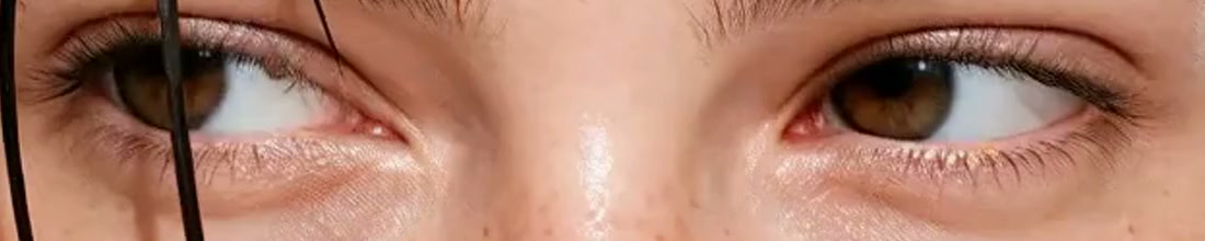
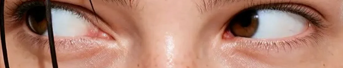
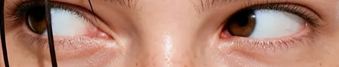
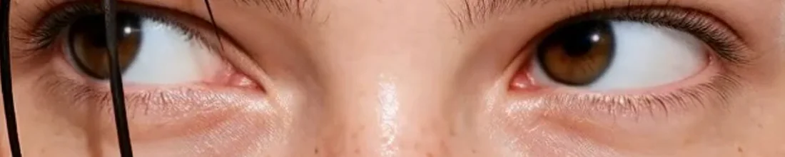
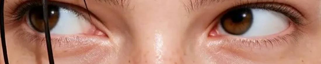
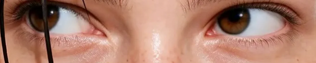
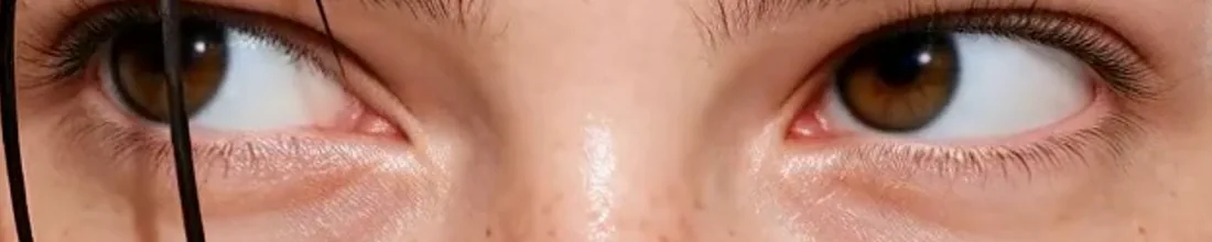
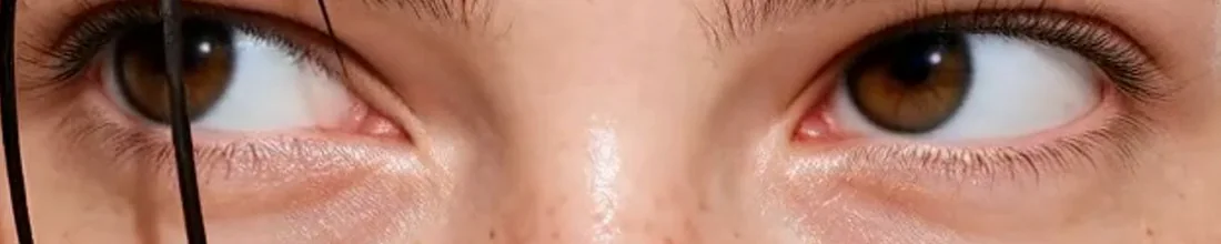
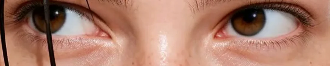
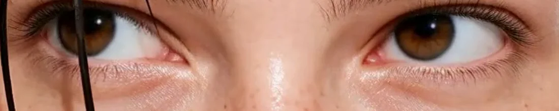
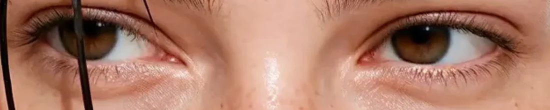
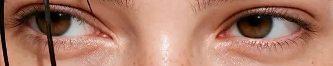
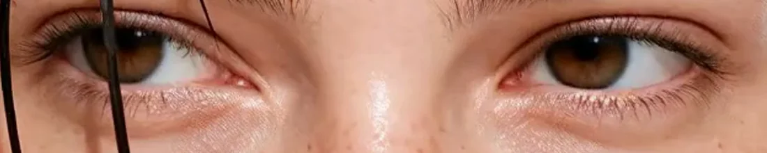
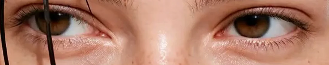
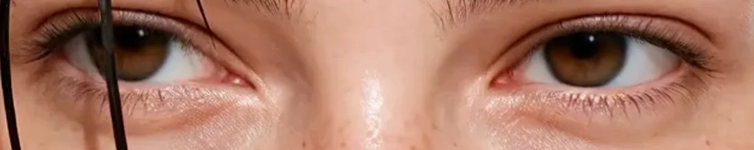
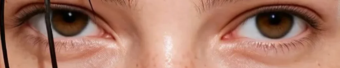
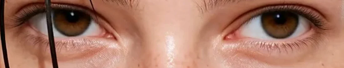
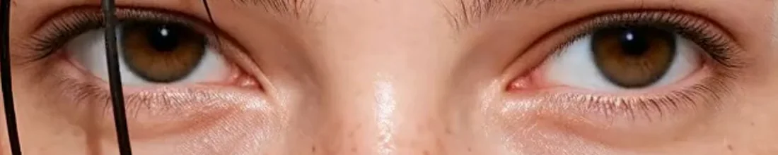
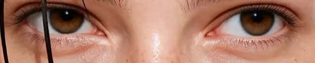
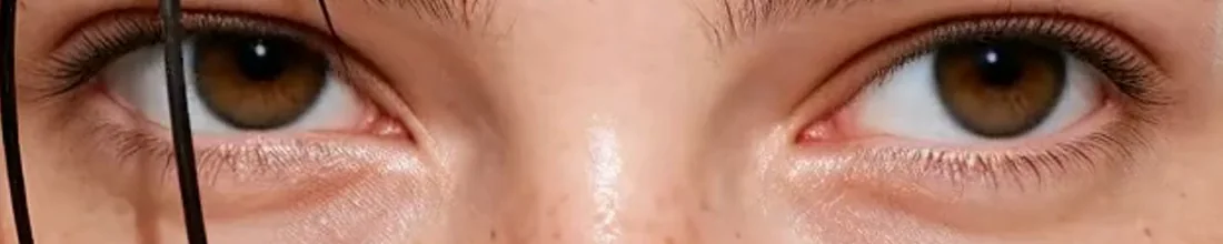
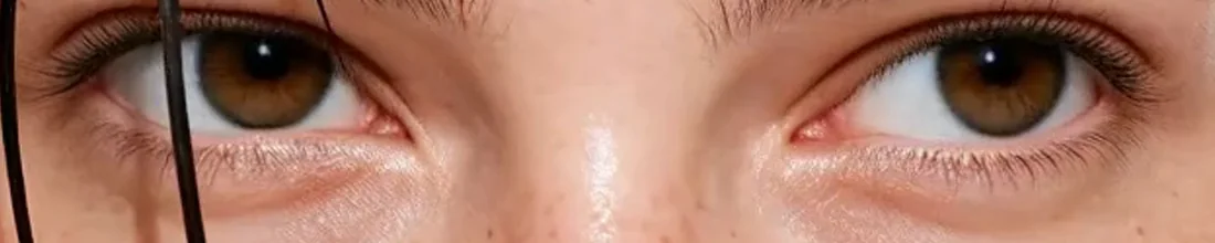
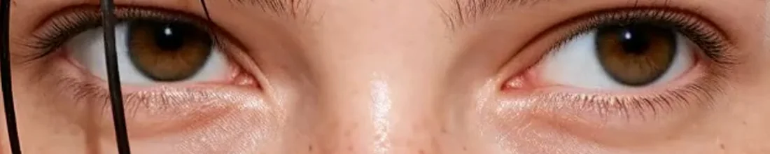
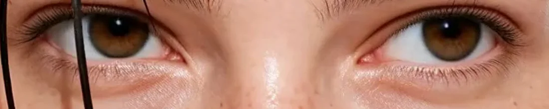
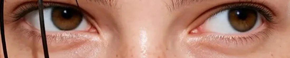
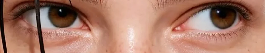
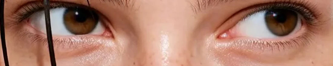
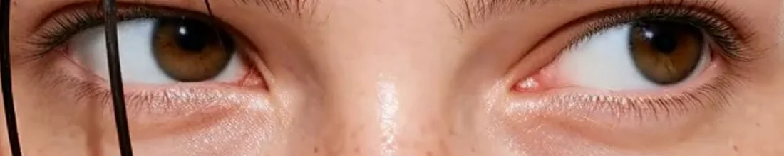
Photography stays bright and close, with real skin, loose hair and a little spilled matcha. The energy comes from the people; the calm comes from the drink. Every image was created with generative AI.사진은 밝고 가깝게 담았습니다. 꾸미지 않은 피부, 흐트러진 머리, 살짝 흘린 말차까지. 에너지는 사람에게서, 차분함은 한 잔에서 나옵니다. 모든 이미지는 생성 AI로 만들었습니다.


IDENTITYIDENTITY
The identity runs on two scales. A hand-cut wordmark with a gentle bounce sets the tone on cups and bags, while a plain grotesk at poster size gives the name its weight.아이덴티티는 두 가지 크기로 움직입니다. 컵과 쇼핑백에서는 살짝 통통 튀는 손글씨 워드마크로 분위기를 만들고, 포스터에서는 담백한 그로테스크 서체로 이름에 무게를 줍니다.
Colour does the rest: one saturated green for the brand, a warm earth brown for coffee and roasted tea, and plenty of cream in between.나머지는 컬러가 맡습니다. 브랜드를 위한 진한 초록 한 가지, 커피와 호지차를 위한 따뜻한 흙빛 브라운, 그리고 그 사이를 채우는 넉넉한 크림색.


PACKAGINGPACKAGING
The packaging system covers everything that leaves the café: cups with a single green print, takeaway bags and boxes, menus, and stone-ground matcha sold in 30 g boxes for home.패키지는 카페 밖으로 나가는 모든 것을 다룹니다. 초록 한 가지로 인쇄한 컵, 테이크아웃 백과 박스, 메뉴판, 그리고 집에서 격불할 수 있는 30g 말차 박스까지.
Every piece repeats the same lock-up, SLOW MATCHA over ZERO RUSH, ABSOLUTE GREEN, so the brand is recognisable from a cup lid to a building-sized banner.모든 패키지에 SLOW MATCHA와 ZERO RUSH, ABSOLUTE GREEN.을 같은 조합으로 반복해, 컵 뚜껑부터 건물 크기의 배너까지 한눈에 알아볼 수 있게 했습니다.


